6 Tests of Correlation and Bivariate regression
(PSY206) Data Management and Analysis
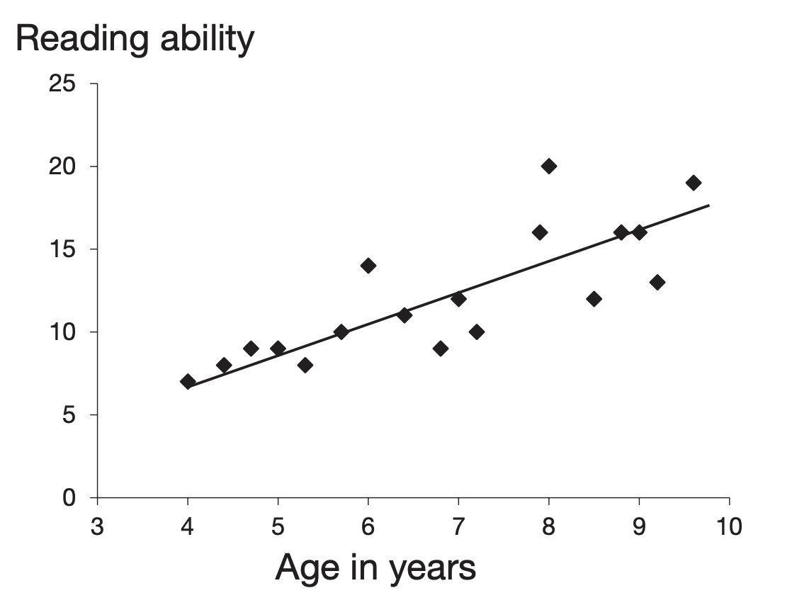
Researchers often wish to measure the strength of the relationship between two variables. For example, there is likely to be a relationship between age and reading ability in children. A test of correlation provides a measure of the strength and direction of such a relationship.
In a correlation study there is no independent variable: you simply measure two variables. For instance, to investigate the relationship between smoking and respiratory function you could measure the number of cigarettes people smoke and their respiratory function, and then test for a correlation between those two variables.
Correlation does not imply causation. Any correlation could be explained by a third variable. For example, there may be a correlation between ice cream sales and drowning incidents. Temperature is a plausible third variable that explains both. Even when a cause-and-effect interpretation seems reasonable, correlation alone is not sufficient evidence to prove causation.
Francis Galton carried out early work on correlation. Karl Pearson later developed Pearson’s product moment correlation coefficient (Pearson’s r) for parametric data. If the data are nonparametric, or if the relationship is not linear, use a nonparametric test such as Spearman’s \(r_s\).
For a correlation coefficient to be reliable, aim for at least 100 observations when possible; small samples are sensitive to extreme scores that can mask or create spurious relationships. A scatterplot is a useful diagnostic tool for checking outliers and assessing linearity.
6.1 Producing a Scatterplot
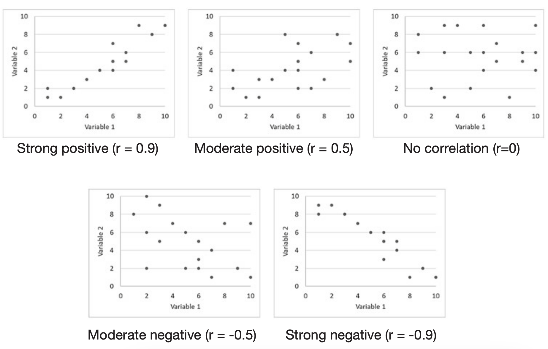
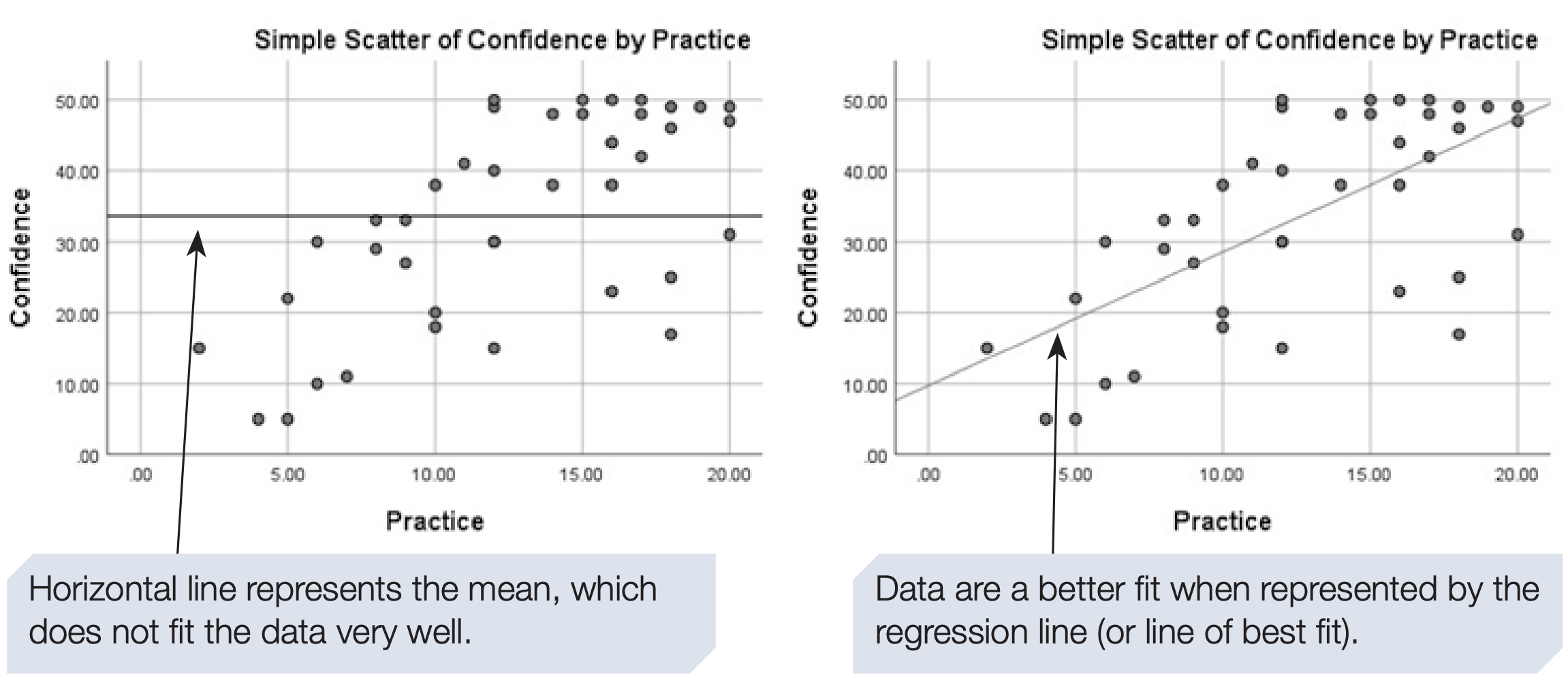
A scatterplot (or scattergram) gives a quick visual indication of whether two items are related in a linear fashion. Each point represents one case. The line running through the data points is the regression line. It represents the best-fitting straight line through the points. If the line slopes upward from left to right, we have a positive correlation: as one variable increases, the other tends to increase. The closer the points lie to the line, the stronger the correlation. If all points fall exactly on a straight line, the correlation is perfect.
A downward slope indicates a negative correlation: as one variable increases, the other tends to decrease.
Correlation coefficients range from -1 to 1. Interpret them as follows:
- 1: perfect positive correlation
- -1: perfect negative correlation
- 0: no linear relationship
In practice coefficients fall between these extremes. As a rough guide to strength:
- 0.7 to 1: strong relationship
- 0.3 to 0.6: moderate relationship
- 0 to 0.2: weak relationship
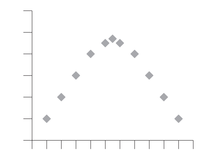
The magnitude of the coefficient reflects how line-like the pattern of points is. Randomly scattered points give a coefficient near zero. The scatterplot also helps to identify nonlinear relationships, for example an inverted U-shape, which Pearson’s \(r\) cannot capture.
This chapter focuses on linear relationships only.
Example study: Age vs CFF
- Mason et al. (1982) investigated whether the negative correlation between age and critical flicker frequency (CFF) differed for people with multiple sclerosis compared with controls. For teaching, we provide a control sample that reproduces some reported findings.
- CFF can be described briefly and somewhat simplistically as follows: If a light is flickering on and off at a low frequency, most people can detect the flicker; if the frequency of flicker is increased, eventually it looks like a steady light. The frequency at which someone can no longer perceive the flicker is called the critical flicker frequency (CFF).
- Data can be downloaded by clicking here.
- Below we show how to obtain a scatterplot in SPSS using Legacy Dialogs and Chart Builder, including screenshots of the SPSS dialogs and the chart editor.
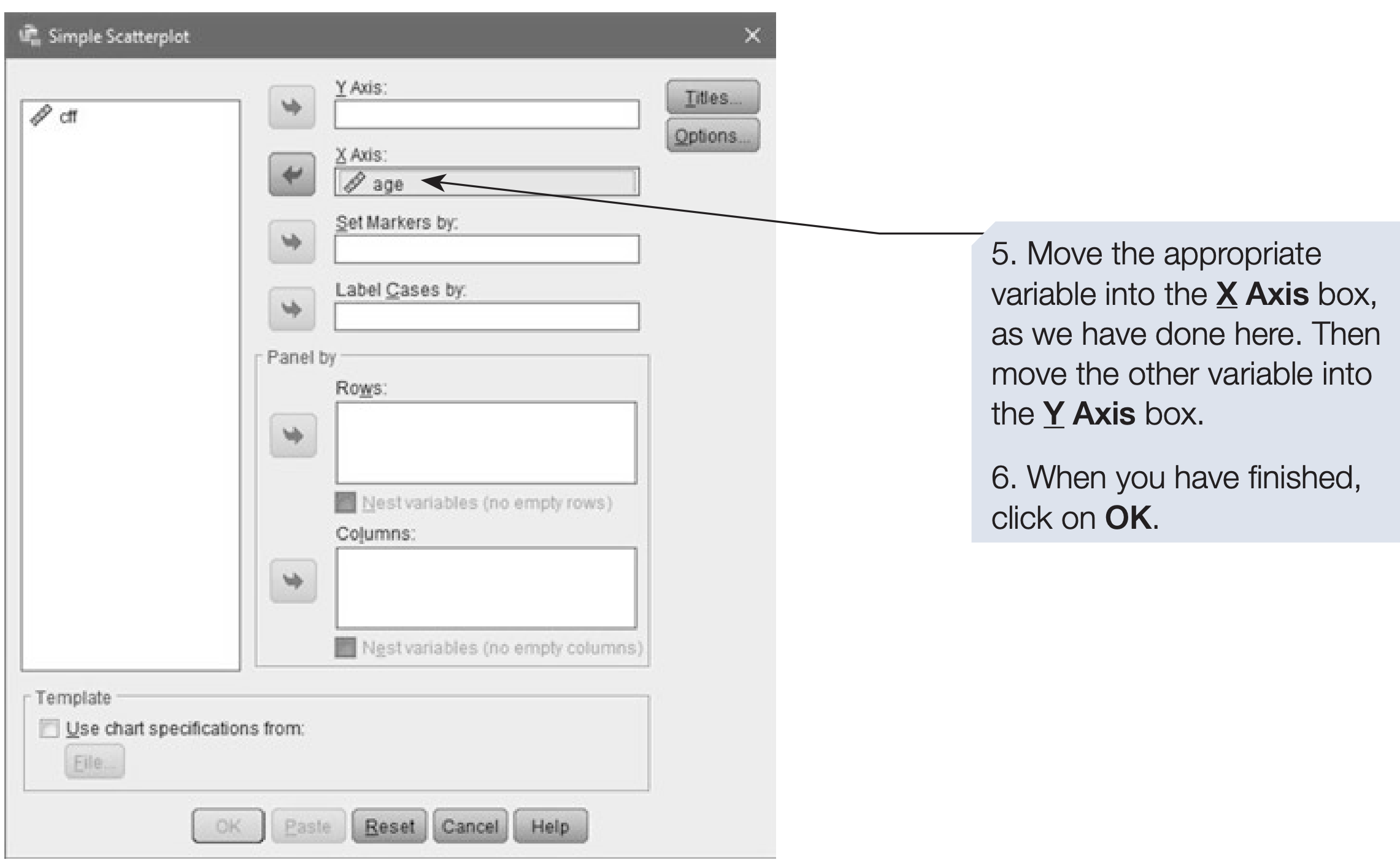
How to obtain a scatterplot using Legacy Dialogs
- On the menu bar, click on
Graphs. - Click on
Legacy Dialogs. - Click on
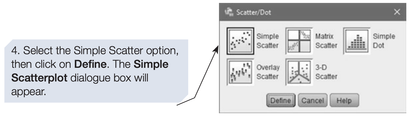
Scatter/Dotand the Scatter/Dot dialog will appear.
The scatterplot appears in the SPSS Output Viewer. You can edit it there. The Chart Builder route below allows you to add a regression line directly in the dialog.
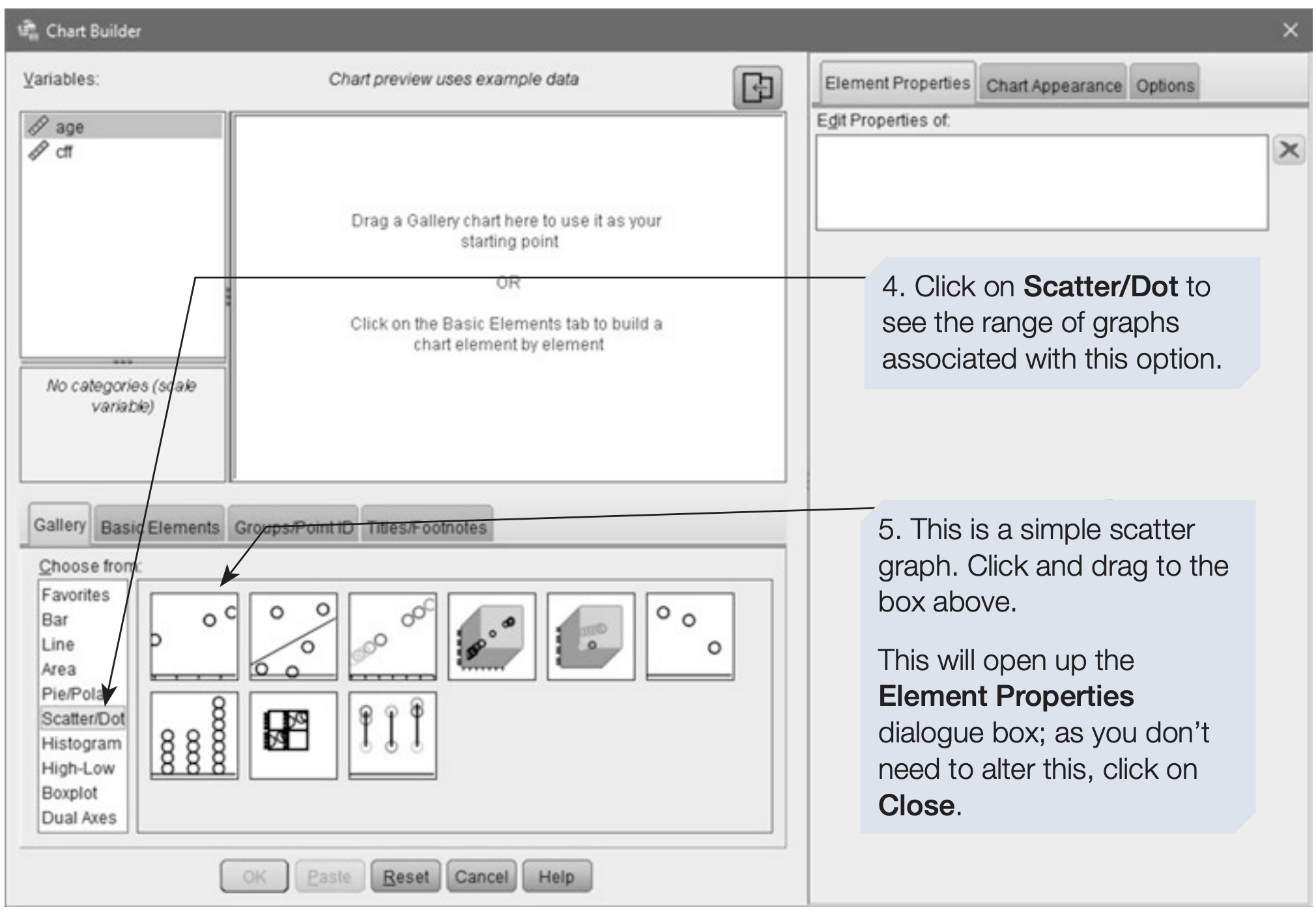
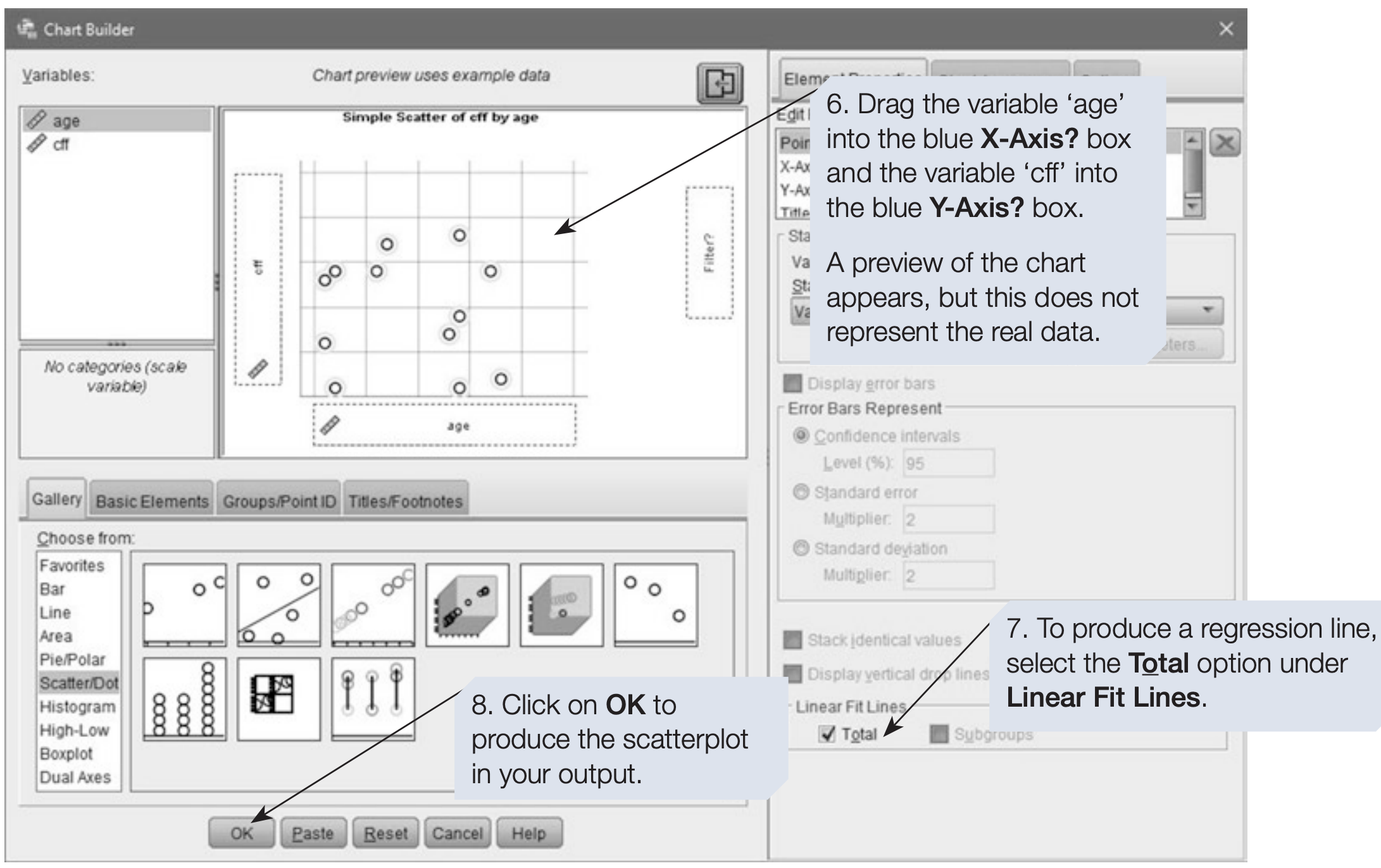
Producing a scatterplot with a regression line using Chart Builder
- On the menu bar, click on
Graphs. - Click on
Chart Builder. - If a reminder about measurement levels appears, confirm that your variables are set correctly and click OK. To add a regression line both variables must be set to Scale in Variable View.
SPSS Syntax for Scatterplot (Legacy Dialogs)
GRAPH
  /SCATTERPLOT(BIVAR)=age WITH cff.
6.2 How to add a regression equation to the scatterplot
To add the regression equation to the plot, open the SPSS Chart Editor by double-clicking the graph in the Output Viewer. Then use the chart editor options to add a fit line and display the equation.
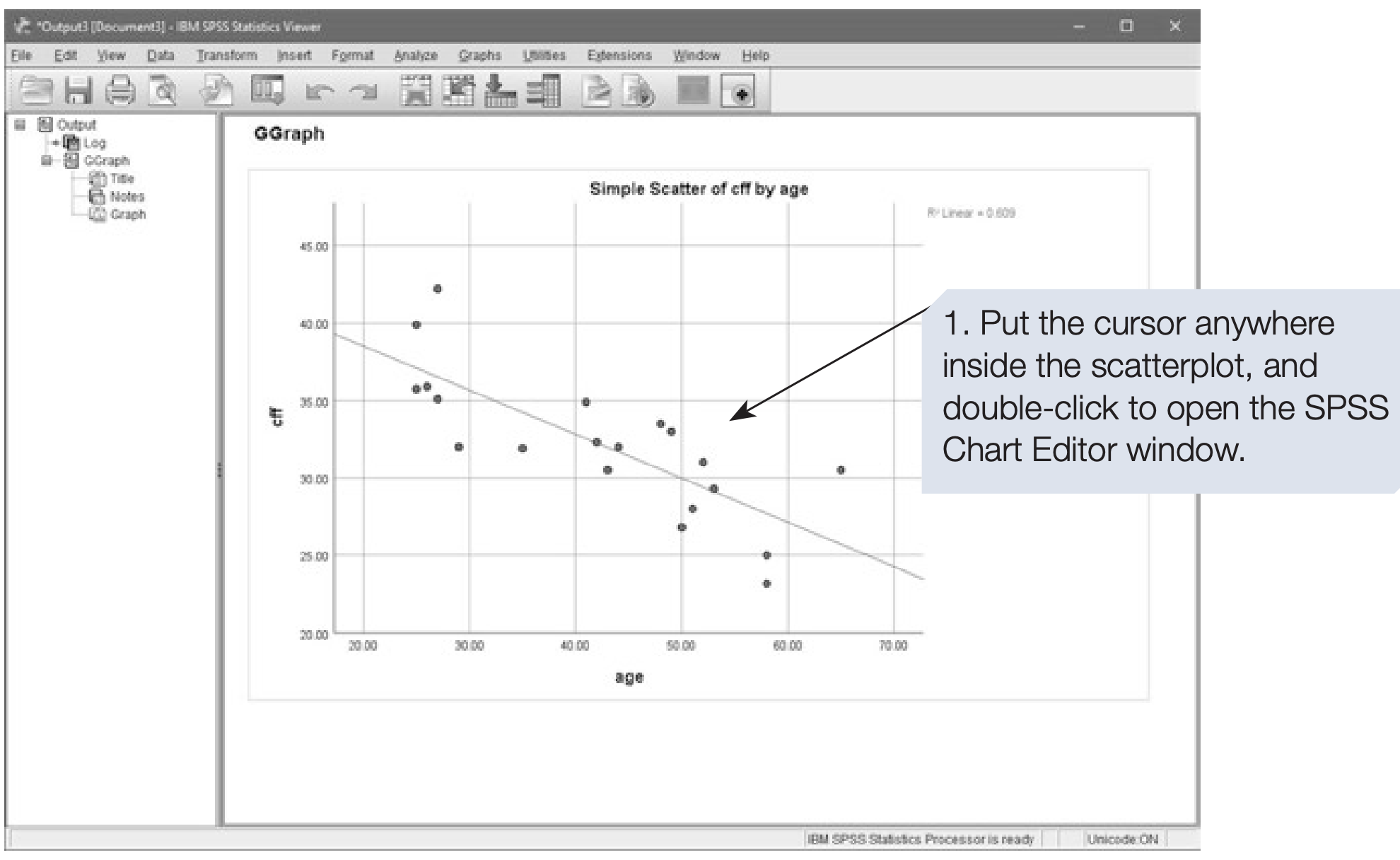
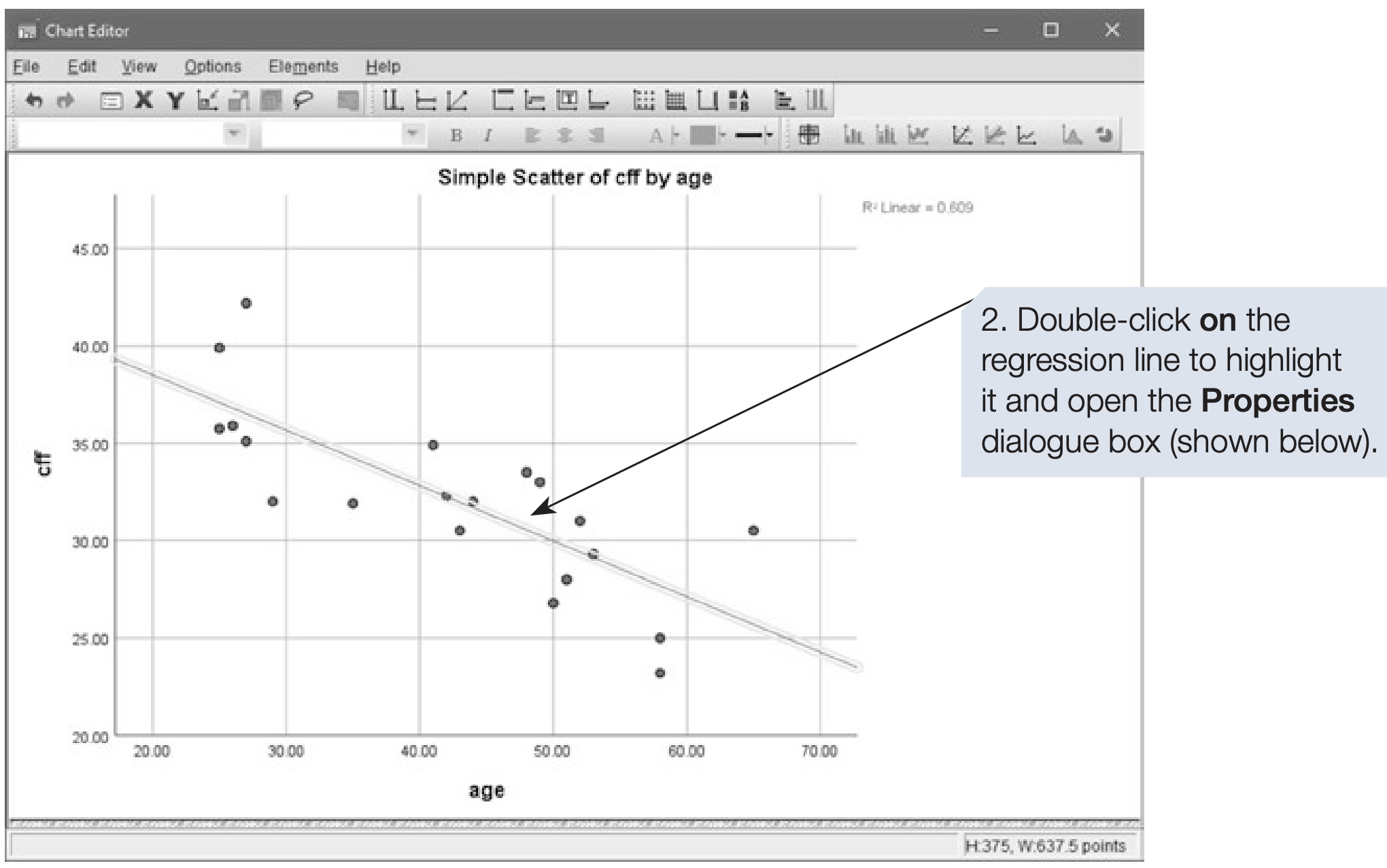
A scatterplot is a descriptive graph that helps assess whether the data are suitable for a correlation test. Outliers or nonlinear patterns may invalidate Pearson’s r. If the relationship looks linear and assumptions are reasonable, proceed to inferential tests.
6.3 Pearson’s \(r\): Parametric Test of Correlation
Example: CFF and age
We continue with the CFF and age data. Note that this example uses a small sample. The hypothesis was that CFF and age would be negatively correlated. Each participant’s CFF score was the mean of six repeated measures.
How to perform Pearson’s r
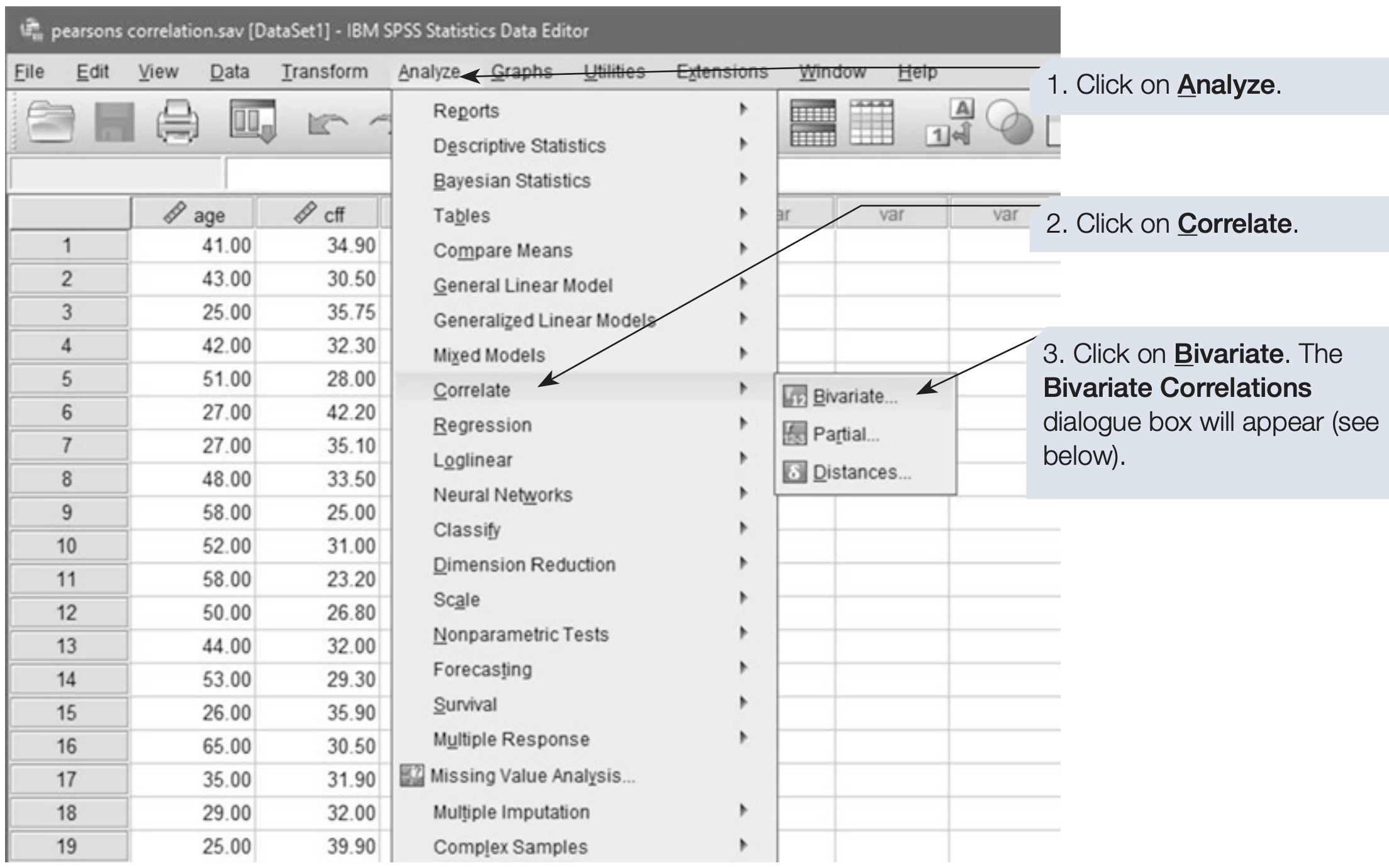
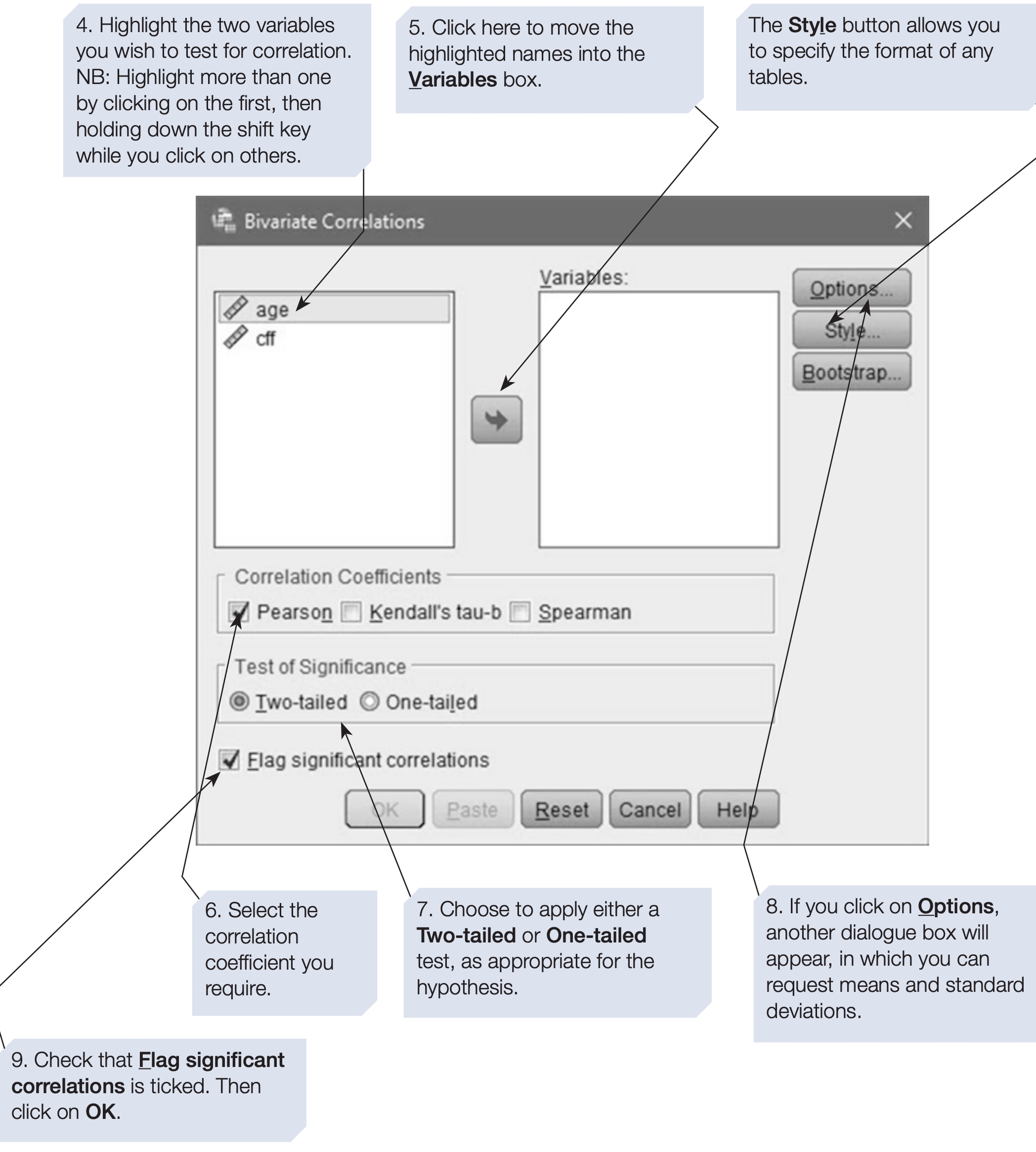
SPSS will compute pairwise correlations for every variable you include. If you include three variables A, B and C, it computes AB, AC and B*C.
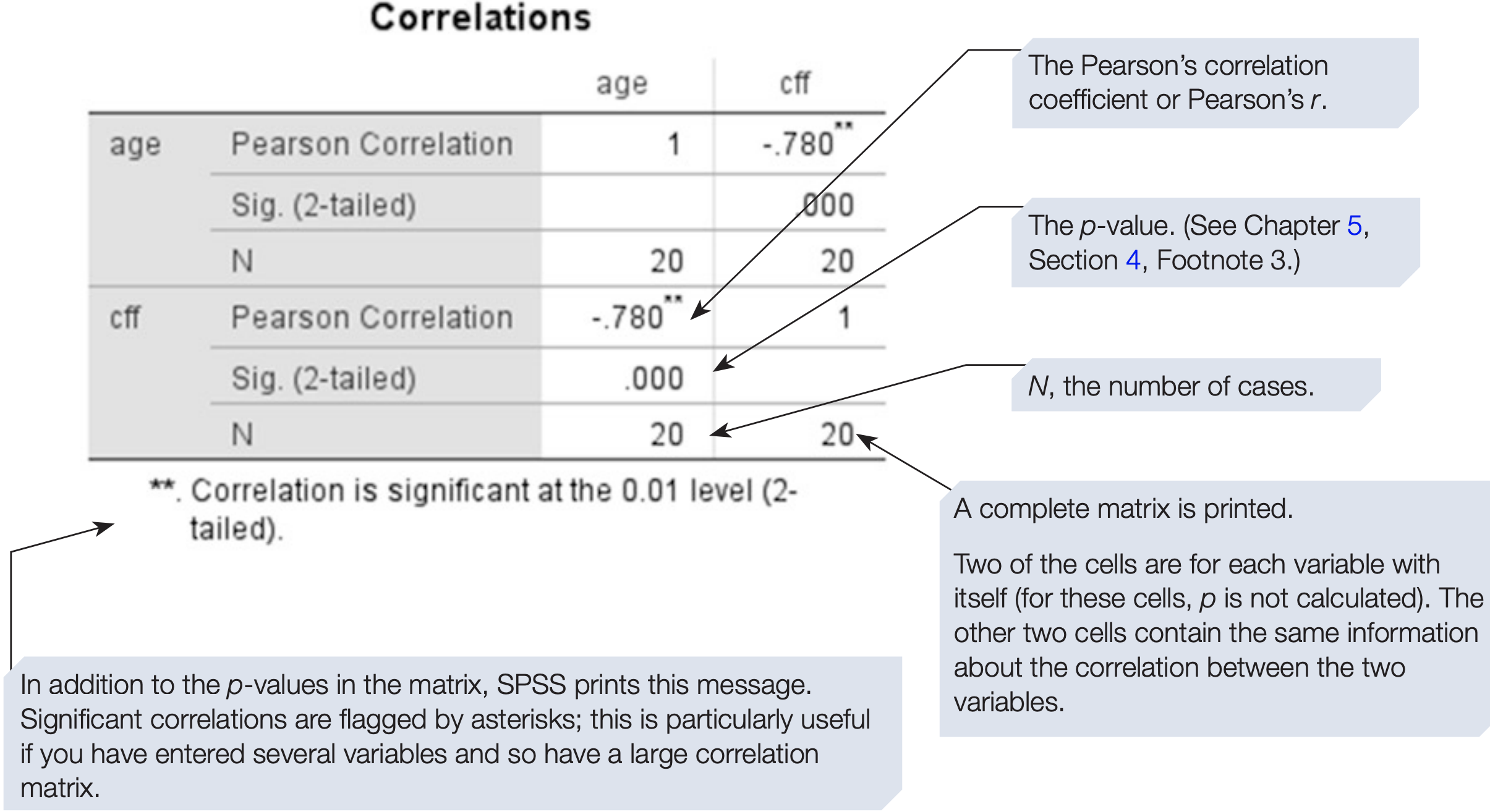
For correlations, the sign of the coefficient indicates direction, so always report it.
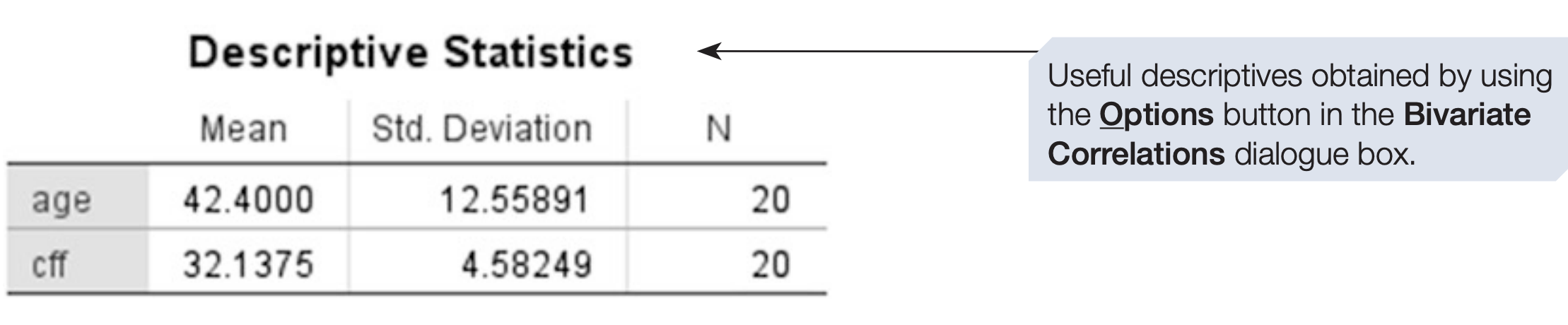
Effect size and proportion of variance
The value of \(r\) measures strength of association and also serves as an effect size. As a rough guide, r between 0 and .2 is weak, .3 to .6 moderate and .7 to 1 strong. Statistical significance should also be reported, because sample size affects the interpretation of \(r\): with small samples even large \(r\) may be due to chance, while with large samples small \(r\) can be statistically significant.
The proportion of variation explained is \(r^{2}\). For example, if \(r = 0.78\), then \(r^{2} = 0.78^{2} = 0.6084\), so about 60.84% of the variation in one variable is associated with variation in the other.
Reporting example
There was a significant negative correlation between age and CFF (\(r\) = -0.78, \(N\) = 20, \(p\) < .001, one-tailed). It is a fairly strong correlation: 60.84% of the variation is explained. The scatterplot shows the data are approximately linear with no obvious outliers.
6.4 Introduction to Regression
Regression, like correlation, concerns relationships between variables. However, regression can be used for prediction. Regression predicts scores on one variable from scores on one or more other variables.
Regression distinguishes dependent and independent variables. The dependent variable is the outcome or criterion. The independent variables are predictors.
One predictor gives bivariate regression. Two or more predictors give multiple regression (Chapter 10).
Predictors may be measured on various scales, but the criterion should be interval or ratio.
Human behaviour is noisy. Regression reduces prediction error compared with using the mean, but residual error remains. Residuals are the differences between observed and predicted values.
As with correlation, bivariate regression does not imply causation unless the predictor has been manipulated.
Regression as a model
A model seeks to explain and simplify measured data to make predictions. The simplest model is the mean. If the mean confidence of students after a module is 33.58 (scale 1 to 50), one could predict that future students will score 33.58. This ignores other predictors such as practice time.
Measuring additional predictors and fitting a regression line can reduce prediction error compared with using the mean. Figure 6.6 compares the mean and a regression line as prediction models.
Residuals quantify prediction error for each case. We discuss residual diagnostics and assumptions in later sections.
6.5 Bivariate Regression
Earlier sections focused on correlation, which measures the strength and direction of association between two variables. Regression goes one step further by allowing prediction.
The term bivariate indicates that two variables only are involved, distinguishing it from multiple regression.
We continue with the familiar example:
- Age (years)
- Critical Flicker Frequency (CFF): the frequency at which flicker is no longer perceived
These data were previously analysed using Pearson’s r.
Correlation versus Regression
Correlation treats both variables symmetrically and asks:
How strongly are the two variables related?
Regression distinguishes variables and asks:
How well can one variable be predicted from the other?
Because prediction does not imply causation, we prefer the terms:
- Predictor variable (X)
- Criterion variable (Y)
In this example:
- Age is the predictor (X)
- CFF is the criterion (Y)
This choice is based on substantive reasoning, although mathematically the regression could be reversed with identical fit.
The Bivariate Regression Equation
A linear bivariate regression is described by: \[ Y = a + bX \]
where:
- Y = predicted value of the criterion variable
- X = predictor variable
- a = intercept (value of Y when X = 0)
- b = slope or regression coefficient
Interpretation:
- a (intercept) defines where the regression line crosses the Y-axis
- b (slope) gives the expected change in Y for a one-unit increase in X
Both parameters are provided directly by SPSS.
As always, avoid extrapolating predictions far beyond the observed range of X.
Proportion of Variance Explained
In bivariate regression, the proportion of variance in Y explained by X is given by: \(r^2\)
Example:
- If \(r = -0.78\)
- Then \(r^2 = 0.61\)
This means that 61% of the variance in CFF is associated with age.
SPSS Procedure for Bivariate Regression
- Analyze → Regression → Linear…
- Move the criterion variable to Dependent
(e.g.,cff) - Move the predictor variable to Independent(s)
(e.g.,age) - Keep Method = Enter
- Click OK
Or use syntax:
REGRESSION
  /DEPENDENT your_dependent_variable
  /METHOD=ENTER your_independent_variable.
For the age–CFF example:
REGRESSION
  /DEPENDENT cff
  /METHOD=ENTER age.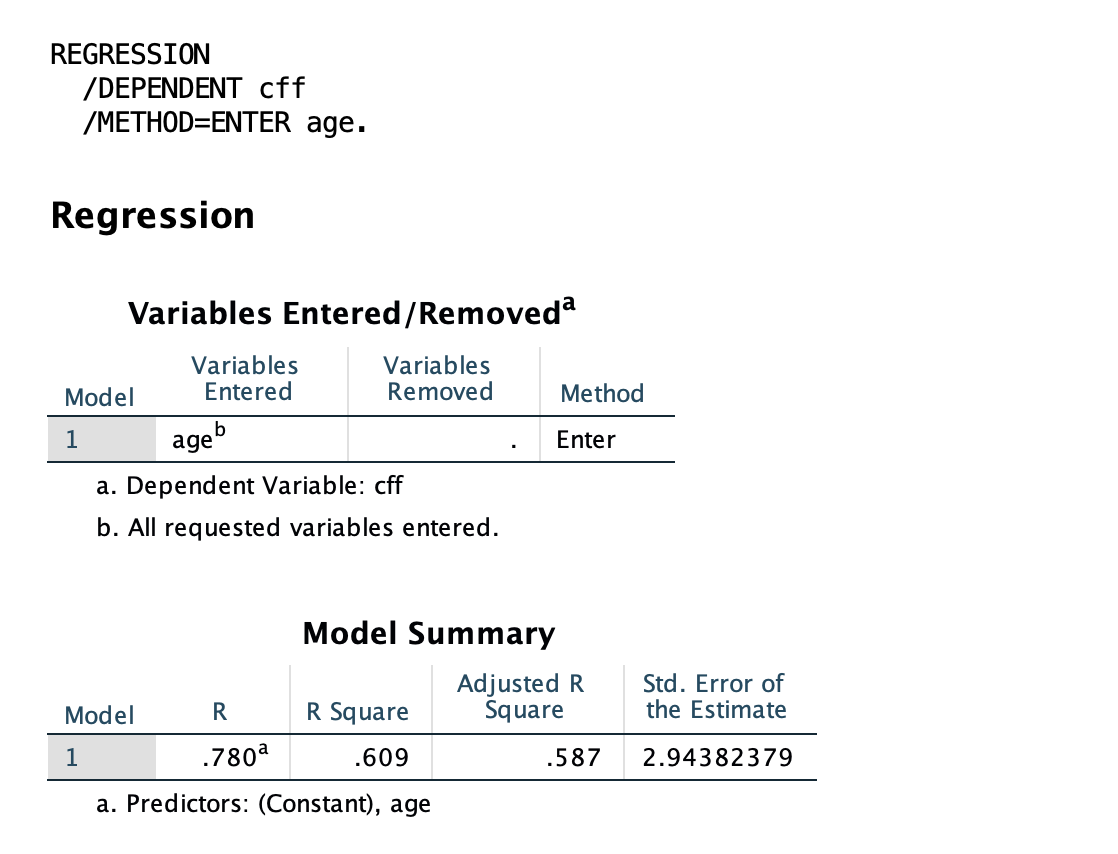
Interpreting SPSS Output
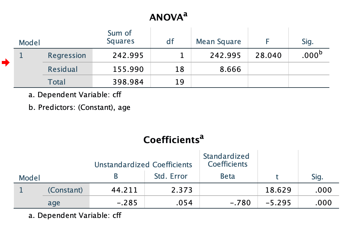
- ANOVA table → tests whether the regression model is statistically significant
- Coefficients table → intercept (a) and slope (b)
- Age is a significant negative predictor of CFF.
- For each additional year of age, predicted CFF decreases by 0.285 Hz on average.
- R and R² → strength of prediction and variance explained
- The model explains 60.9% of the variance in CFF (R² = .609).